Creating visuals with variable dimensions
-
Populate the shelves of the visual:
- From Dimension, select and move
Stnamefield onto the X Axis shelf. - From Measures, select and move
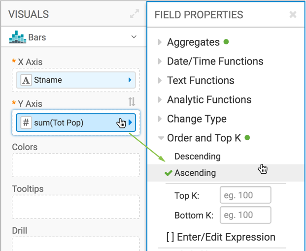
Tot Popfield onto the Y Axis shelf. On the Y Axis shelf, change the aggregation of the Tot Pop field from
sum(Tot Pop)toavg(Tot Pop): selectTot Popfield, chose the Aggregates menu, and change the aggregate from Sum to Average.- On the Y Axis shelf, click
Tot Pop, and under the Field Properties menu select Order, and choose Ascending.
- From Dimension, select and move
-
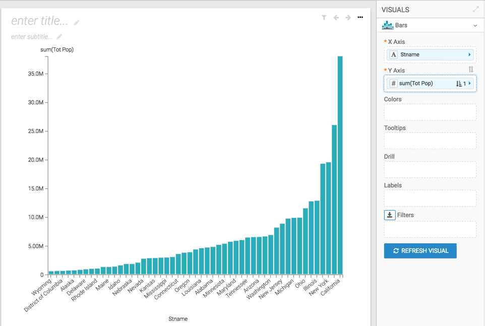
Click Refresh Visual to see the basic set up of the bar chart.
-
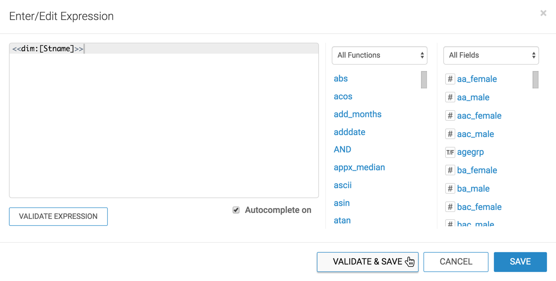
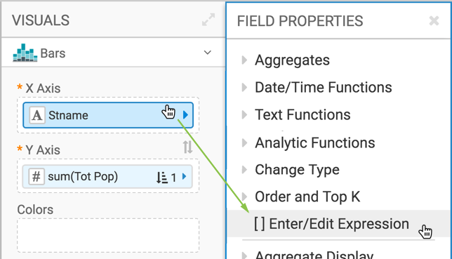
In the Field Properties menu, select [ ] Enter/Edit
Expression.
-
Click Validate & Save.