US county map with bubbles
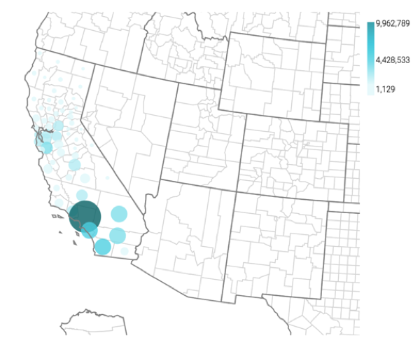
Cloudera Data Visualization Map visuals let you plot measurements, as bubbles, over US County regions. Bubble maps display up to two measurements simultaneously: as the color of the bubble, and as the relative size of the bubble.
A county map of the United States shows a comparison of measurement values across US
States. The following steps extend the work completed in State map with bubbles
and demonstrate how to create a map visual on the dataset US County
Populations [data source samples.us_counties]. This produces a
map with bubble marks that correspond to the total population of each county.
-
Click REFRESH VISUAL.
The map visual appears. Note that if you have Zoom enabled, the map automatically zooms in to show detail of California. For more information, see Customizing zoom.